 Two of the things that most annoy me 1:some of the colouring in parts. The lighter/vivid areas look all right to me, but it gets ugly and muddy in the dark corners. Fuh. Remember to plan next time! 2: Composition; I think my first drawing was better composed than the final. But I'll admit that composition is probably my weakest or one the weakest points of my work. A lot of the time it's from over-working and analyzing the image, trying to get it to conform to my elementary understanding of flow and it screws up the image almost every time.
April 28, 2010
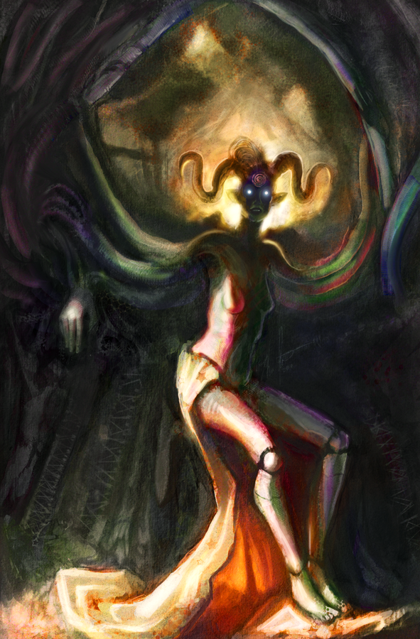
A crappy colouring job
Not too happy with the image, but glad it's out of the way. I learned a lot more about colour process, and I have a few more ideas I want to play out in future images. Hopefully those are better.
Two of the things that most annoy me 1:some of the colouring in parts. The lighter/vivid areas look all right to me, but it gets ugly and muddy in the dark corners. Fuh. Remember to plan next time! 2: Composition; I think my first drawing was better composed than the final. But I'll admit that composition is probably my weakest or one the weakest points of my work. A lot of the time it's from over-working and analyzing the image, trying to get it to conform to my elementary understanding of flow and it screws up the image almost every time.
Two of the things that most annoy me 1:some of the colouring in parts. The lighter/vivid areas look all right to me, but it gets ugly and muddy in the dark corners. Fuh. Remember to plan next time! 2: Composition; I think my first drawing was better composed than the final. But I'll admit that composition is probably my weakest or one the weakest points of my work. A lot of the time it's from over-working and analyzing the image, trying to get it to conform to my elementary understanding of flow and it screws up the image almost every time.
Subscribe to:
Post Comments (Atom)
2 comments:
I FOUND YOU!!!!!
I think there needs to be more of a transition between the purple parts of the painting and the immediate areas of color surrounding it particularly on the right leg, or tone down the purple a lot.
The composition ain't that bad at all! Just that the way the cape flows into an angle at the top left is a bit distracting from the overall flow. Just try taking out some of the purple in parts or toning it down a bit. I like the bottom left part of the composition looks like a crucifix!
Thaaaaaaaaanks Daaaaaaaan =3
Post a Comment